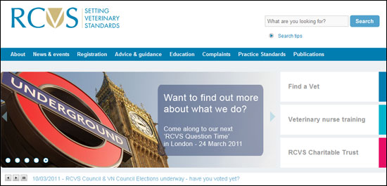
New look, new website!
14 March 2011
Today we're delighted to launch our brand new website, which also marks the first public outing for our new livery.

The development process for the site has been lengthy and included several stages of research with website visitors to ensure that it is as user-friendly as possible.
Key changes include:
- A fresh, professional-looking design, with vast improvements to how information is organised, navigation and search facilities
- A multi-purpose home page, with ‘quick links’ to popular areas, photographic banners to highlight key responsibilities and ongoing activities, a ticker-tape feed for quick updates, news items, so
The new identity is modern in feel but, through its use of a shield device, maintains a link with our long history.
cial media links and an RSS feed - Information for veterinary surgeons and veterinary nurses arranged thematically, rather than by audience – for example, ‘Education’, ‘Advice and Guidance’ and ‘Registration’ – to reflect the recent introduction of the Register for Veterinary Nurses, which brings the RCVS requirements for VNs closer into line with those for veterinary surgeons. This also responds to an increasing ‘team’ approach within practice
- A ‘My Account’ facility to enable veterinary surgeons to confirm their registration renewal details and pay their retention fees online – other functions will be added across the year
- A separate section for animal owners, with the popular Find a Vet search tool at its heart, plus expanded advice for animal owners when choosing, and using, a veterinary practice, and, in case of need, when making a complaint
- Dedicated sub-sites for the veterinary nursing awarding body – RCVS Awards – which is a separate organisation from the College, and for the RCVS Charitable Trust
- Improved search functions for the whole site, and dedicated search tools for Guides to Professional Conduct, publications, documents and the news archive
- Feedback forms and quick polls
Communication through design
Our new corporate look and feel enhances the site. It’s designed to be fresh, uncluttered and professional, and our new logo and strapline – “setting veterinary standards” – should leave visitors in no doubt as to our key purpose as a regulatory body.
The new identity is modern in feel but, through its use of a shield device, maintains a link with our long history.
It was described by veterinary surgeons and veterinary nurses who helped to develop the brand as “simple, clear and clean, with a strong message” and “modern and approachable” – reflecting key principles of the College.
Using a blue and gold colour scheme, it was referred to by one of the research contributors as conveying a "gold standard" of service – something we continually aim to achieve.
“The College has been accused of being ‘confused and confusing’ in the past,” says President Peter Jinman. “With the new identity we have endeavoured to clarify that the College is a forward-thinking regulator – despite being established when Queen Victoria was only recently on the throne, and working to 45-year-old legislation.
“Changing the logo, font and colours we use is only a small part of the process though,” says Peter.
“Our branding review included several layers of research and we now have a better understanding of how we have been perceived, how we would like to be perceived, and what we need to do to get there.
"This includes changing how we behave and communicate as an organisation, as well as how we position ourselves to the outside world.”
The new look, which includes new logos for RCVS Awards, the RCVS Charitable Trust and the Practice Standards Scheme, will be rolled out across other communications elements as the year unfolds, to avoid the unnecessary wastage of materials branded with the old identity.
Meanwhile, the website is a living medium, so the College is keen to hear feedback from users about what they like, and what could be improved, to help inform further developments.